

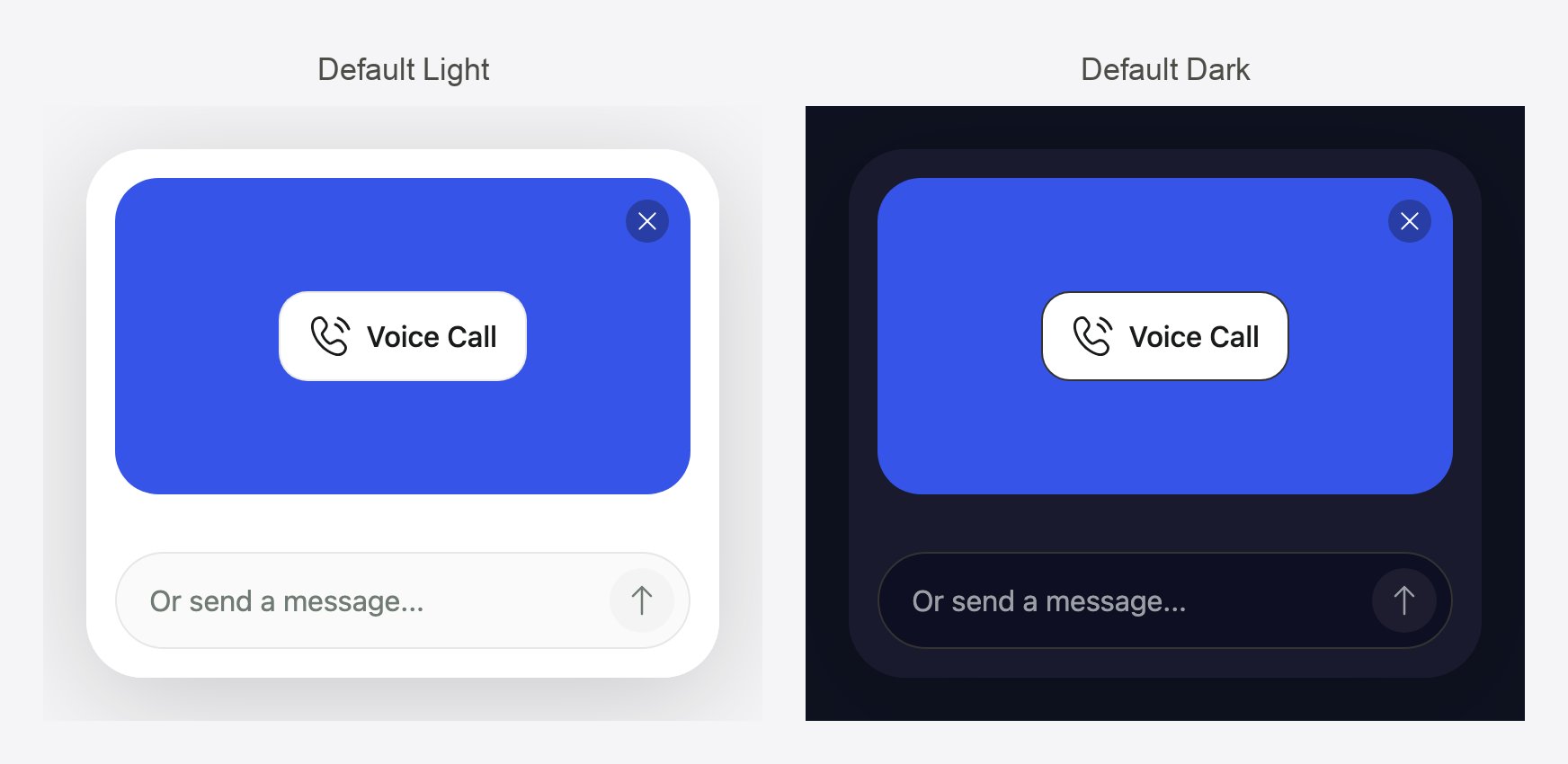
The two palettes a theme starts from: Default Light and Default Dark.
Which theme wins
Set the theme on the agent so every installation looks right by default, and override it in code only where one site needs something different.
The Widgets library
Widgets in the sidebar (under Resources) is your organization’s library of reusable widget templates and themes. Admins can open it.- Widget templates are saved in-call forms (see In-call forms). When you add a widget step to any agent, you can start from a template.
- Themes are saved looks. Apply one to any agent, or edit it and save it back to the library.
Widget templates page
The page lists every template as a card with its name and creation date. From here you can:
Templates provided by Callers are marked as system templates and can’t be edited or deleted. Template names must be unique in your organization and up to 255 characters.
Picking a template for a widget step copies its content into the step. Later changes to the template don’t affect steps that already use it.
Save a form as a template
While editing a widget step in any agent, click the Save as template icon in the editor header, enter a Template name, and click Save. The form is added to the library for your whole team.Build a theme
The theme builder lives in the widget editor’s preview panel. You reach it from any widget step in an agent, or from the Widgets library.1
Open the preview
In the widget editor, click the preview toggle. A live widget renders on the right.
2
Open Themes
Click Open themes in the preview bar. The Themes list shows Default Light, Default Dark, the agent’s current unsaved theme (if any), and your library themes.
3
Pick or create
Click a theme to apply it to the preview. To start a new one, click Create a New Theme. To change an existing theme, open its menu and choose Edit.
4
Adjust the controls
Work through the General, Questions, Answers, and Background tabs (reference below). The preview updates as you go. Use Preview content to switch between sample conversations, such as an answered form, a view-only popover, or an inline card, so you can check every surface.
5
Save
Click Save. Inside an agent, this applies the theme to that agent. On the Widgets page, it saves to the library. To put an agent’s theme in the library, click the Save as template icon next to the name.
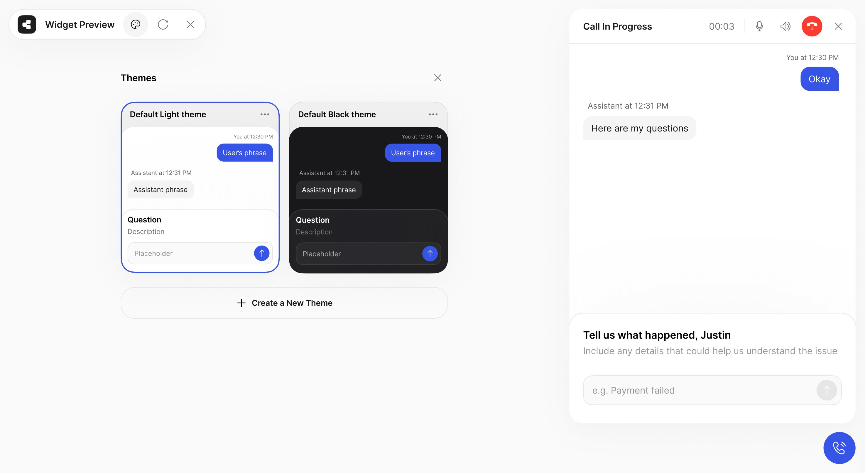
The Themes list in the widget preview, with Default Light selected and Create a New Theme below.
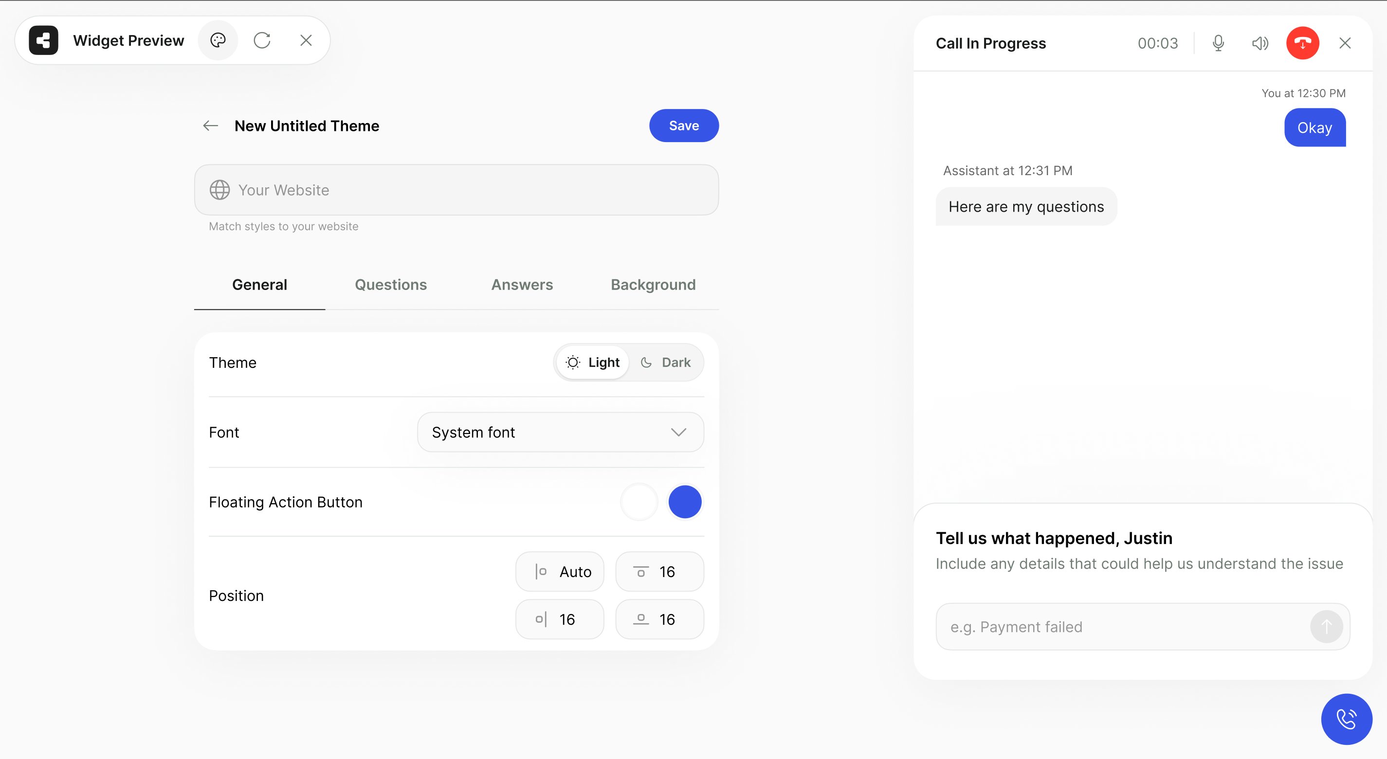
The theme builder's General tab next to the live preview.
Theme controls
Colors accept any CSS color value. The hang-up button keeps a fixed red in every theme so visitors always recognize it.
Apply a theme to an agent
An agent has one theme, which applies to the whole widget. It is saved when you add or save a widget step with that theme selected in the preview panel:- Open the agent’s script and open any widget step (or add one with Widget).
- Open the preview, click Open themes, and pick the theme.
- Click Add or Save on the step, then save the agent.
data-theme.
Override a theme in code
For a quick light or dark widget, or a per-site override, adddata-theme to the script tag:
data-theme also accepts a full theme JSON. For the JSON structure, runtime changes with setTheme() (for example, following your site’s dark-mode switch), and launcher position options, see Theming. You can try themes live in the SDK playground.
Related
Installing the widget
Enable the widget and paste the script tag.
In-call forms
Build the forms your templates contain.
Theming reference
Every theme field, with a complete example.
Avatars
Add a talking avatar to the call window.