> ## Documentation Index
> Fetch the complete documentation index at: https://docs.callers.ai/llms.txt
> Use this file to discover all available pages before exploring further.
# Styling the Widget
> Match the widget to your brand - colors, fonts, corner radii, and text sizes - using the visual theme builder or a theme configuration you pass to the SDK.
## How Theming Works
The widget ships with two built-in palettes, **light** and **dark**. A theme is simply a set of overrides layered on top of one of them:
```json theme={null}
{
"base": "light",
"fab": { "backgroundColor": "#3655e8" }
}
```
Everything you don't specify keeps the value from the base palette, so a theme can be two lines or fifty. You never need to restyle the whole widget just to change one color.
A theme becomes a set of CSS custom properties set on the widget's host element, which the widget's shadow DOM reads from the inside. Because the markup lives in a shadow root, your page's stylesheets can't select into the widget, and the widget's own styles can't leak out onto your page.
***
## Step 1: Build the Theme
The fastest way to produce a theme is the **[SDK Playground](https://sdk-playground.callers.dev/)** - it gives you every control as a form field with a live widget next to it, so you can see each change immediately.
Enter your campaign ID and secret, then click **Load SDK**.
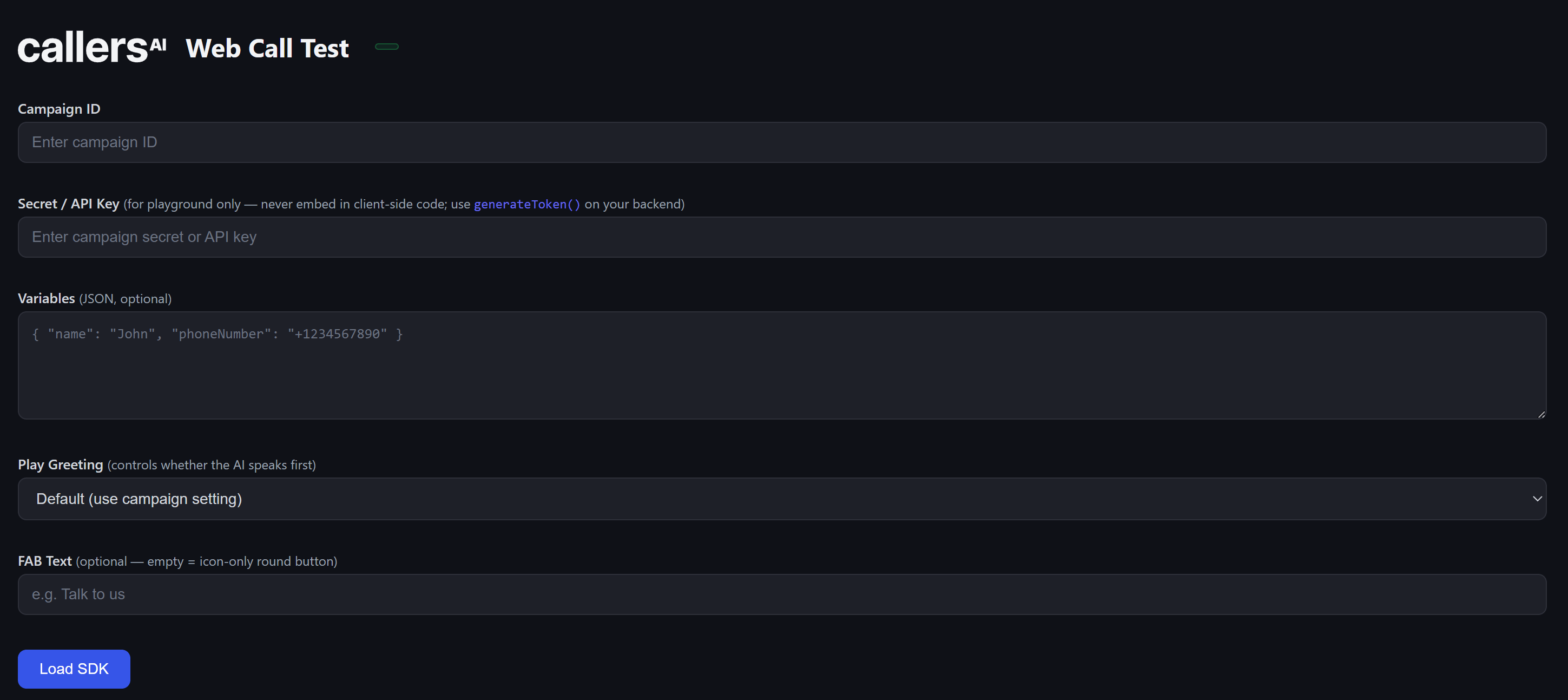 Now scroll to **Theme Customization** and start adjusting. Press **Apply Theme** to push your changes into the live widget, or **Reset** to go back to the base palette.
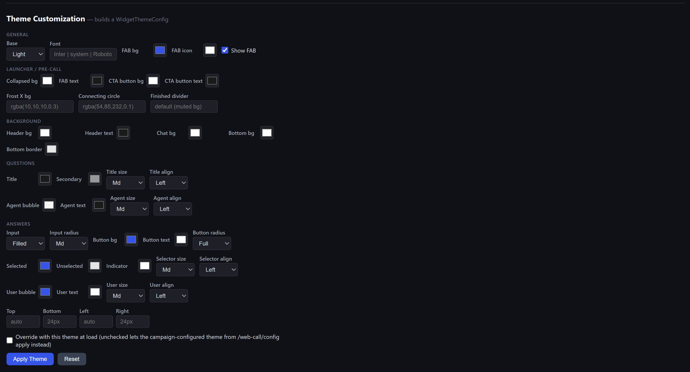 The configuration on the right rebuilds itself as you touch the controls, so you are always looking at the exact JSON your current settings produce. The widget in the corner only restyles when you press **Apply Theme** - that's the moment your configuration is handed to the running widget.
 ### What Each Group Controls
The starting palette (**light** or **dark**), the font family, and the floating action button - its background color and icon color.
Everything the visitor sees *before* the conversation starts: the collapsed launcher pill and its label, the call-to-action button on the pre-call card, the frosted close button, the connecting indicator, and the divider shown after a call finishes.
Surface colors for the three regions of the panel - the header, the chat area, and the bottom bar - plus their borders.
How the agent's side of the conversation looks: title color, size, and alignment, the secondary text color, and the agent's message bubble.
How the visitor's side looks: text inputs (filled or outlined, corner radius), the submit button, choice selectors, and the visitor's own message bubble.
The hang-up button keeps a fixed red color in every theme. It is deliberately not overridable - visitors need to recognize it instantly.
***
## Step 2: Apply the Theme
When the widget looks right, copy the generated configuration from the playground.
### What Each Group Controls
The starting palette (**light** or **dark**), the font family, and the floating action button - its background color and icon color.
Everything the visitor sees *before* the conversation starts: the collapsed launcher pill and its label, the call-to-action button on the pre-call card, the frosted close button, the connecting indicator, and the divider shown after a call finishes.
Surface colors for the three regions of the panel - the header, the chat area, and the bottom bar - plus their borders.
How the agent's side of the conversation looks: title color, size, and alignment, the secondary text color, and the agent's message bubble.
How the visitor's side looks: text inputs (filled or outlined, corner radius), the submit button, choice selectors, and the visitor's own message bubble.
The hang-up button keeps a fixed red color in every theme. It is deliberately not overridable - visitors need to recognize it instantly.
***
## Step 2: Apply the Theme
When the widget looks right, copy the generated configuration from the playground.
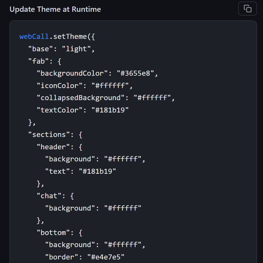 There are three places you can put it. Pick the one that matches how you installed the widget.
### On the Script Tag
If you installed the widget with the embed snippet, add a `data-theme` attribute. It takes the full configuration as JSON:
```html theme={null}
```
For a plain light or dark widget with no other changes, there's a shorthand:
```html theme={null}
```
The attribute value must be valid JSON in single quotes. If it can't be parsed, the SDK logs an error to the browser console and falls back to the default theme.
### In the SDK
If you build your own integration, pass the configuration as the `theme` option:
```javascript theme={null}
import { WebCall } from '@callers/web-sdk';
const webCall = new WebCall({
token,
theme: {
base: 'dark',
fab: { backgroundColor: '#1930a3', iconColor: '#ffffff' },
sections: {
header: { background: '#16213e', text: '#eeeeee' },
},
},
});
```
The SDK also exports the two built-in palettes, so you can start from one and override just what you need:
```javascript theme={null}
import { WebCall, DEFAULT_DARK_THEME } from '@callers/web-sdk';
const webCall = new WebCall({
token,
theme: { ...DEFAULT_DARK_THEME, fab: { backgroundColor: '#1930a3' } },
});
```
### At Runtime
Call `setTheme()` to restyle a widget that's already on the page. This is what you want if your site has its own light/dark switch:
```javascript theme={null}
const prefersDark = window.matchMedia('(prefers-color-scheme: dark)');
prefersDark.addEventListener('change', ({ matches }) => {
webCall.setTheme({ base: matches ? 'dark' : 'light' });
});
```
The change applies immediately, including mid-conversation.
***
## Which Theme Wins
A widget can receive a theme from two directions, so the order matters:
Anything set through `data-theme`, the `theme` option, or `setTheme()` always wins.
If you pass nothing, the widget uses the theme saved on the campaign, fetched when it loads.
If neither exists, the widget falls back to Default Light.
In practice: set the theme on the campaign so every installation looks right by default, and override it in code only where a specific site needs something different.
***
## Configuration Reference
Every field is optional except `base`. Anything you leave out inherits from the base palette.
### Top Level
| Field | Type | Description |
| ------------- | --------------------- | ----------------------------------------------------------------------- |
| `base` | `"light"` \| `"dark"` | **Required.** The palette everything else layers onto. |
| `name` | string | An optional label for your own reference. |
| `font.family` | string | `"Inter"` (default), `"system"`, or any family your page already loads. |
### Floating Button - `fab`
| Field | Description |
| --------------------- | ------------------------------------------------------------ |
| `backgroundColor` | Background of the round button. |
| `iconColor` | Phone icon color. |
| `text` | Label next to the icon. Leave empty for an icon-only circle. |
| `collapsedBackground` | Background of the pill when a label is present. |
| `textColor` | Color of that label. |
### Panel Surfaces - `sections`
| Field | Description |
| --------------------------------------------------------------------- | ------------------------------------- |
| `header.background` / `header.text` / `header.icon` / `header.border` | The top bar of the panel. |
| `chat.background` | The conversation area. |
| `bottom.background` / `bottom.border` | The input bar at the bottom. |
| `precall.ctaButtonBackground` / `precall.ctaButtonText` | The button on the pre-call card. |
| `precall.frostBackground` | The frosted close button. |
| `precall.connectingBackground` | The indicator shown while connecting. |
| `precall.finishedBackground` | The divider shown after a call ends. |
### Agent Side - `questions`
| Field | Type | Description |
| ---------------------------------------------- | -------------------- | -------------------------------- |
| `titles.fontSize` | `sm` \| `md` \| `lg` | Title size. Default `md`. |
| `titles.align` | `left` \| `center` | Title alignment. Default `left`. |
| `titles.color` | color | Main title color. |
| `titles.secondaryColor` | color | Supporting text color. |
| `agentBubble.background` / `.text` / `.border` | color | The agent's message bubble. |
| `agentBubble.fontSize` | `sm` \| `md` \| `lg` | Bubble text size. Default `md`. |
| `agentBubble.align` | `left` \| `center` | Bubble text alignment. |
### Visitor Side - `answers`
| Field | Type | Description |
| --------------------------------------------------- | ------------------------------ | ----------------------------------- |
| `input.variant` | `filled` \| `outline` | Text field style. Default `filled`. |
| `input.radius` | `sm` \| `md` \| `lg` \| `full` | Text field corners. Default `md`. |
| `button.background` / `button.text` | color | The submit button. |
| `button.radius` | `sm` \| `md` \| `lg` \| `full` | Button corners. Default `full`. |
| `selectors.selected` / `.unselected` / `.indicator` | color | Radio and checkbox colors. |
| `selectors.size` | `sm` \| `md` \| `lg` | Selector text size. Default `md`. |
| `selectors.align` | `left` \| `center` | Selector alignment. |
| `userBubble.background` / `.text` / `.border` | color | The visitor's message bubble. |
| `userBubble.fontSize` | `sm` \| `md` \| `lg` | Bubble text size. Default `md`. |
| `userBubble.align` | `left` \| `center` | Bubble text alignment. |
### Scale Values
The size and radius keywords resolve to fixed values, so spacing stays consistent no matter which you pick:
| Keyword | Titles | Body text | Radius |
| ------- | ------ | --------- | ------------- |
| `sm` | 16px | 14px | 8px |
| `md` | 18px | 16px | 16px |
| `lg` | 20px | 20px | 24px |
| `full` | - | - | fully rounded |
Colors accept any CSS color value - hex, `rgb()`, or `rgba()` when you need transparency.
***
## A Complete Example
A dark widget in a deep blue brand palette:
```json theme={null}
{
"base": "dark",
"name": "Brand Dark",
"font": { "family": "Inter" },
"fab": {
"backgroundColor": "#1930a3",
"iconColor": "#ffffff",
"text": "Talk to us",
"collapsedBackground": "#1a1a2e",
"textColor": "#eeeeee"
},
"sections": {
"header": { "background": "#16213e", "text": "#eeeeee" },
"chat": { "background": "#1a1a2e" },
"bottom": { "background": "#16213e", "border": "#2a2a3e" }
},
"questions": {
"titles": { "color": "#ffffff", "fontSize": "md" },
"agentBubble": { "background": "#22223a", "text": "#eeeeee" }
},
"answers": {
"input": { "variant": "filled", "radius": "md" },
"button": { "background": "#1930a3", "text": "#ffffff", "radius": "full" },
"userBubble": { "background": "#1930a3", "text": "#ffffff" }
}
}
```
***
## Next Steps
* Not installed yet? Start with [Installing the Widget](/documentation/widget-campaigns/installing-the-widget).
* Passing visitor details into the conversation is covered in the [installation guide](/documentation/widget-campaigns/installing-the-widget#passing-visitor-information).
There are three places you can put it. Pick the one that matches how you installed the widget.
### On the Script Tag
If you installed the widget with the embed snippet, add a `data-theme` attribute. It takes the full configuration as JSON:
```html theme={null}
```
For a plain light or dark widget with no other changes, there's a shorthand:
```html theme={null}
```
The attribute value must be valid JSON in single quotes. If it can't be parsed, the SDK logs an error to the browser console and falls back to the default theme.
### In the SDK
If you build your own integration, pass the configuration as the `theme` option:
```javascript theme={null}
import { WebCall } from '@callers/web-sdk';
const webCall = new WebCall({
token,
theme: {
base: 'dark',
fab: { backgroundColor: '#1930a3', iconColor: '#ffffff' },
sections: {
header: { background: '#16213e', text: '#eeeeee' },
},
},
});
```
The SDK also exports the two built-in palettes, so you can start from one and override just what you need:
```javascript theme={null}
import { WebCall, DEFAULT_DARK_THEME } from '@callers/web-sdk';
const webCall = new WebCall({
token,
theme: { ...DEFAULT_DARK_THEME, fab: { backgroundColor: '#1930a3' } },
});
```
### At Runtime
Call `setTheme()` to restyle a widget that's already on the page. This is what you want if your site has its own light/dark switch:
```javascript theme={null}
const prefersDark = window.matchMedia('(prefers-color-scheme: dark)');
prefersDark.addEventListener('change', ({ matches }) => {
webCall.setTheme({ base: matches ? 'dark' : 'light' });
});
```
The change applies immediately, including mid-conversation.
***
## Which Theme Wins
A widget can receive a theme from two directions, so the order matters:
Anything set through `data-theme`, the `theme` option, or `setTheme()` always wins.
If you pass nothing, the widget uses the theme saved on the campaign, fetched when it loads.
If neither exists, the widget falls back to Default Light.
In practice: set the theme on the campaign so every installation looks right by default, and override it in code only where a specific site needs something different.
***
## Configuration Reference
Every field is optional except `base`. Anything you leave out inherits from the base palette.
### Top Level
| Field | Type | Description |
| ------------- | --------------------- | ----------------------------------------------------------------------- |
| `base` | `"light"` \| `"dark"` | **Required.** The palette everything else layers onto. |
| `name` | string | An optional label for your own reference. |
| `font.family` | string | `"Inter"` (default), `"system"`, or any family your page already loads. |
### Floating Button - `fab`
| Field | Description |
| --------------------- | ------------------------------------------------------------ |
| `backgroundColor` | Background of the round button. |
| `iconColor` | Phone icon color. |
| `text` | Label next to the icon. Leave empty for an icon-only circle. |
| `collapsedBackground` | Background of the pill when a label is present. |
| `textColor` | Color of that label. |
### Panel Surfaces - `sections`
| Field | Description |
| --------------------------------------------------------------------- | ------------------------------------- |
| `header.background` / `header.text` / `header.icon` / `header.border` | The top bar of the panel. |
| `chat.background` | The conversation area. |
| `bottom.background` / `bottom.border` | The input bar at the bottom. |
| `precall.ctaButtonBackground` / `precall.ctaButtonText` | The button on the pre-call card. |
| `precall.frostBackground` | The frosted close button. |
| `precall.connectingBackground` | The indicator shown while connecting. |
| `precall.finishedBackground` | The divider shown after a call ends. |
### Agent Side - `questions`
| Field | Type | Description |
| ---------------------------------------------- | -------------------- | -------------------------------- |
| `titles.fontSize` | `sm` \| `md` \| `lg` | Title size. Default `md`. |
| `titles.align` | `left` \| `center` | Title alignment. Default `left`. |
| `titles.color` | color | Main title color. |
| `titles.secondaryColor` | color | Supporting text color. |
| `agentBubble.background` / `.text` / `.border` | color | The agent's message bubble. |
| `agentBubble.fontSize` | `sm` \| `md` \| `lg` | Bubble text size. Default `md`. |
| `agentBubble.align` | `left` \| `center` | Bubble text alignment. |
### Visitor Side - `answers`
| Field | Type | Description |
| --------------------------------------------------- | ------------------------------ | ----------------------------------- |
| `input.variant` | `filled` \| `outline` | Text field style. Default `filled`. |
| `input.radius` | `sm` \| `md` \| `lg` \| `full` | Text field corners. Default `md`. |
| `button.background` / `button.text` | color | The submit button. |
| `button.radius` | `sm` \| `md` \| `lg` \| `full` | Button corners. Default `full`. |
| `selectors.selected` / `.unselected` / `.indicator` | color | Radio and checkbox colors. |
| `selectors.size` | `sm` \| `md` \| `lg` | Selector text size. Default `md`. |
| `selectors.align` | `left` \| `center` | Selector alignment. |
| `userBubble.background` / `.text` / `.border` | color | The visitor's message bubble. |
| `userBubble.fontSize` | `sm` \| `md` \| `lg` | Bubble text size. Default `md`. |
| `userBubble.align` | `left` \| `center` | Bubble text alignment. |
### Scale Values
The size and radius keywords resolve to fixed values, so spacing stays consistent no matter which you pick:
| Keyword | Titles | Body text | Radius |
| ------- | ------ | --------- | ------------- |
| `sm` | 16px | 14px | 8px |
| `md` | 18px | 16px | 16px |
| `lg` | 20px | 20px | 24px |
| `full` | - | - | fully rounded |
Colors accept any CSS color value - hex, `rgb()`, or `rgba()` when you need transparency.
***
## A Complete Example
A dark widget in a deep blue brand palette:
```json theme={null}
{
"base": "dark",
"name": "Brand Dark",
"font": { "family": "Inter" },
"fab": {
"backgroundColor": "#1930a3",
"iconColor": "#ffffff",
"text": "Talk to us",
"collapsedBackground": "#1a1a2e",
"textColor": "#eeeeee"
},
"sections": {
"header": { "background": "#16213e", "text": "#eeeeee" },
"chat": { "background": "#1a1a2e" },
"bottom": { "background": "#16213e", "border": "#2a2a3e" }
},
"questions": {
"titles": { "color": "#ffffff", "fontSize": "md" },
"agentBubble": { "background": "#22223a", "text": "#eeeeee" }
},
"answers": {
"input": { "variant": "filled", "radius": "md" },
"button": { "background": "#1930a3", "text": "#ffffff", "radius": "full" },
"userBubble": { "background": "#1930a3", "text": "#ffffff" }
}
}
```
***
## Next Steps
* Not installed yet? Start with [Installing the Widget](/documentation/widget-campaigns/installing-the-widget).
* Passing visitor details into the conversation is covered in the [installation guide](/documentation/widget-campaigns/installing-the-widget#passing-visitor-information).